css编写技巧
<style>
  body{
      background-color: black;
  }
  button{
      /* 使用em单位来调节字体和其他属性值的大小,减少改动成本 */
      padding: .2em .5em;
      border: 1px solid  rgba(0,0,0,.1);
      /* 半透明的黑色或白色叠加在主色调上,即可产生主色调的亮
色和暗色变体 */
      background: #58a linear-gradient(hsla(0,0%,100%,.2),
      transparent);
      border-radius: .3em;
      box-shadow: 0 .05em .25em rgba(0,0,0,.5);
      color: white;
      text-shadow: 0 -.05em .05em rgba(0,0,0,.5);
      font-size: 2em;
      /* 使用比例可以确保与字体代下的联动性 */
      line-height: 1.5;
  }
  .ok{
      background-color: #6b0;
  }
  .error{
      background-color: #c00;
  }
</style>

<button class="ok">ok</button>
<button class="error">error</button>currentcolor属性
div{
  color: blue;
  width: 200px;
  height: 200px;
  border: solid;
}

<div></div>
上面代码中,div的边框夜色为蓝色,为什么呢?
原因:mdn中提到边框颜色的初始值为currentcolor.
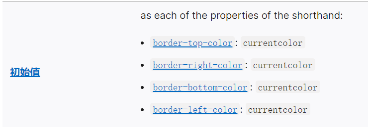
currentcolor:就是当前元素的字体颜色
使用多张背景图片
<style>
  .container {
    width: 500px;
    height: 500px;
    border: 1px solid #000;
		/*     图片地址,背景位置 */
    background: url(./js.webp) top left, url(./异步操作.png) bottom right;
    background-repeat: no-repeat;
    background-size: 20em 20em;
  }
</style>
</head>
<body>
  <div class="container"></div>
</body>background-clip
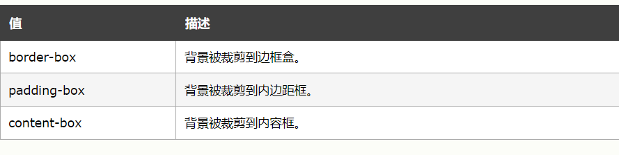
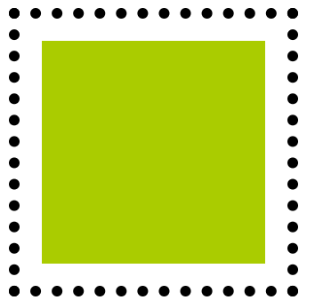
例如:
<style>
  .container {
    width: 200px;
    height: 200px;
    border: 10px dotted #000;
    background: #aacc00;
    background-clip: content-box;
    padding: 20px;
  }
</style>
</head>
<body>
  <div class="container"></div>
</body>效果:背景只包括内容区域
实现多重边框的效果
1.box-shadow方案
<style>
  .container {
    width: 500px;
    height: 500px;
    background: #aeaeae;
    box-shadow: 0 0 0 10px #ee00ee, 0 0 0 15px #000;
  }
</style>2.outline方案
<style>
  .container {
    width: 500px;
    height: 500px;
    background: #aeaeae;
    border: 10px solid #e0e0e0;
    border-radius: 10px;
    outline: 20px solid #000;
  }
</style>background-origin
[background-image](https://developer.mozilla.org/zh-CN/docs/Web/CSS/background-image)<style>
.container {
width: 500px;
height: 500px;
padding: 20px;
background: url(./js.webp) no-repeat #58a bottom right;
background-size: 100px 100px;
background-origin: content-box;
}
</style>背景图片距离的定位以content的区域为原点
线性渐变
<style>
  .container {
    width: 500px;
    height: 500px;
		/*     第二个的位置如果为0,那么它的位置就总是会被浏览器调整为前一个色标的位置值 */
    background: linear-gradient(90deg,#fb3 30%, #58a 0);
  }
</style>第一个参数的表示指向方向:
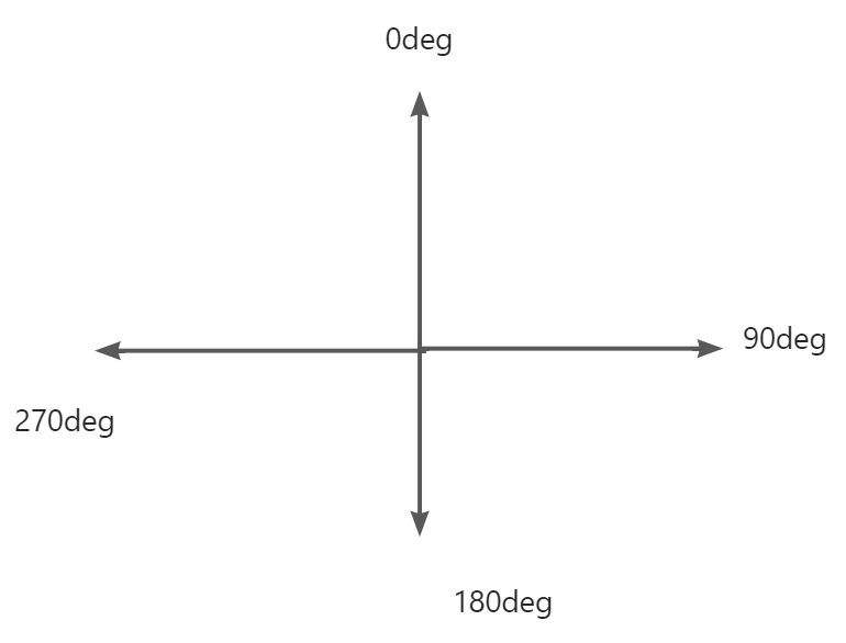
border-radius
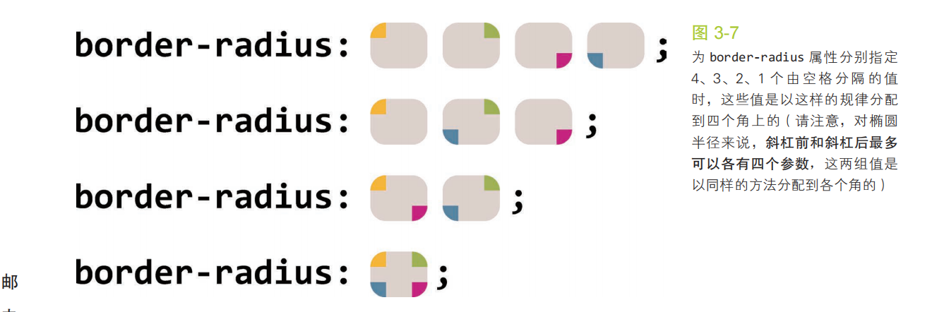
可以通过(水平/垂直)的设置方式来制作椭圆和其他形状
div {
  width: 16em;
	height: 10em;
  background: #fb3;
	border-radius: 50px 100px 150px 200px /20px 30px 40px 50px ;
}
制作1/4圆
div {
	width: 16em;
	height: 10em;
	background: #fb3;
	border-radius:100% 0 0 0;
}
平行四边形
如果直接在标签元素上添加skew,会造成内容也会发生变形,因此使用到了伪元素,改变伪元素的形状达到相应的效果。
/**
 * Parallelograms — with pseudoelements
 */

.button {
	position: relative;
	display: inline-block;
	padding: .5em 1em;
	border: 0; margin: .5em;
	background: transparent;
	color: white;
	text-transform: uppercase;
	text-decoration: none;
	font: bold 200%/1 sans-serif;
}

.button::before {
	content: ''; /* To generate the box */
	position: absolute;
	top: 0; right: 0; bottom: 0; left: 0;
	z-index: -1;
	background: #58a;
	transform: skew(45deg);
}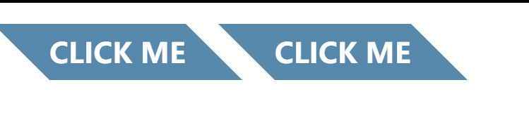
梯形
<!DOCTYPE html>
<html lang="en">
  <head>
    <meta charset="UTF-8" />
    <meta http-equiv="X-UA-Compatible" content="IE=edge" />
    <meta name="viewport" content="width=device-width, initial-scale=1.0" />
    <title>Document</title>
    <style>
      .box {
        position: relative;
        display: inline-block;
        padding: 0.3em 1em 0;
      }
      .box::before {
        content: "";
        position: absolute;
        top: 0;
        right: 0;
        bottom: 0;
        left: 0;
        z-index: -1;
        background: #ccc;
        background-image: linear-gradient(
          hsla(0, 0%, 100%, 0.6),
          hsla(0, 0%, 100%, 0)
        );
        border: 1px solid rgba(0, 0, 0, 0.4);
        border-bottom: none;
        border-radius: 0.5em 0.5em 0 0;
        box-shadow: 0 0.15em white inset;
				/*   perspective 透视的距离(形成近大远小的效果)       */
        transform: perspective(0.5em) rotateX(5deg);
        transform-origin: bottom; //CSS 属性让你更改一个元素变形的原点。
      }
    </style>
  </head>
  <body>
    <div class="box">nav</div>
    <div class="box">home</div>
    <div class="box">detail</div>
  </body>
</html>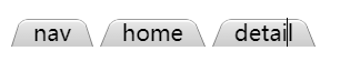
阴影
box-shadow的参数:
单侧阴影
由于模糊距离会放大阴影,当扩张半径为负数时,可以缩小阴影,如果模糊距离和扩张半径正好抵消,那么阴影就和元素的面积一样大,通过偏移一个方向值,就可以达到单侧阴影。
.box {
  width: 100px;
  height: 100px;
  background-color: aqua;
  margin: 50px;
  box-shadow: 0px 5px 4px -4px #333;
}
邻边阴影
.box {
  width: 100px;
  height: 100px;
  background-color: aqua;
  margin: 50px;
  box-shadow: 3px 3px 6px -3px black;
}
双侧阴影
通过设置两个单边阴影来达到对边阴影的效果。
.box {
  width: 100px;
  height: 100px;
  background-color: aqua;
  margin: 50px;
  box-shadow: 3px 0px 3px -3px black, -3px 0px 3px -3px black;
}不规则阴影
由于box-shadow只会对标签设置阴影效果,但是有伪元素,那么不会产生阴影效果。
我们这里可以采用滤镜效果,来达到我们想要的效果。
补充:
filter中常用的函数:
- blur(5px) : 高斯模糊效果
- drop-shadow() :映射阴影效果。
<style>
      * {
        margin: 0;
        padding: 0;
      }
      .box {
        position: relative;
        width: 100px;
        height: 100px;
        text-align: center;
        line-height: 100px;
        background-color: aqua;
        margin: 50px;
        /* box-shadow: 2px 2px 4px #303030; */
				/*
        	drop-shadow()输入图像应用阴影效果;
        	参数分别为 x偏移量  y偏移量  模糊距离 颜色
        */
        filter: drop-shadow(2px 2px 2px #303030);
      }
      .box::after {
        position: absolute;
        content: "";
        top: 1em;
        right: -10px;
        width: 20px;
        height: 20px;
        background-color: aqua;
        transform: rotate(45deg);
      }
    </style>
  </head>
  <body>
    <div class="box">你好啊</div>
  </body>
毛玻璃
<!DOCTYPE html>
<html lang="en">
  <head>
    <meta charset="UTF-8" />
    <meta http-equiv="X-UA-Compatible" content="IE=edge" />
    <meta name="viewport" content="width=device-width, initial-scale=1.0" />
    <title>Document</title>
    <style>
      .bg {
        position: relative;
        z-index: -2;
        width: 500px;
        height: 300px;
        background: url(./laohu.webp) center / cover scroll;
        overflow: hidden;
      }
      .content {
        position: relative;
        width: 300px;
        height: 150px;
        margin: 75px 100px;
        border-radius: 5px;
        background: hsla(0, 0%, 100%, 0.1);
        overflow: hidden; //截掉多出的模糊背景
      }
			/*   在content和背景之间制作模糊效果     */
      .content:before {
        content: "";
        position: absolute;
        z-index: -1;
        top: 0;
        left: 0;
        right: 0;
        bottom: 0;
				/*     与背景图相同,对局部做模糊     */
        background: url(./laohu.webp) center / cover scroll;
        filter: blur(20px);
        margin: -30px;//放大模糊
      }
    </style>
  </head>
  <body>
    <div class="bg">
      <div class="content">
        那轻脆的铃响,那秀丽的流苏,只为佳人那动人的笑靥。长安初雪后,那宫阙重楼里,元宵灯海美如昼。
        一手莲灯,一个心愿,一柄萤扇,一丝心凉,一壶美酒,一滴泪水。轻迈脚步,游走人群,牵着孤独,看海棠花瘦。
      </div>
    </div>
  </body>
</html>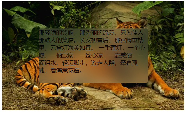
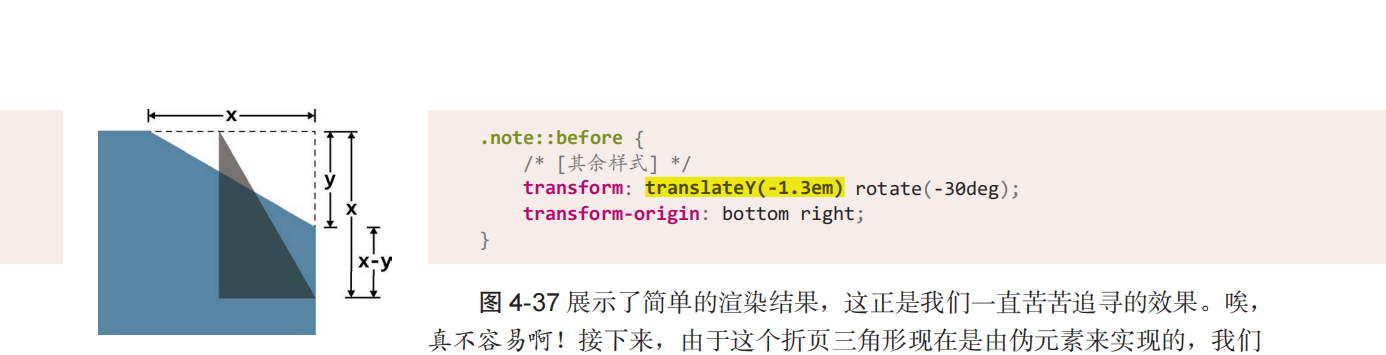
折角效果
正三角形
<!DOCTYPE html>
<html lang="en">
  <head>
    <meta charset="UTF-8" />
    <meta http-equiv="X-UA-Compatible" content="IE=edge" />
    <meta name="viewport" content="width=device-width, initial-scale=1.0" />
    <title>Document</title>
    <style>
        .box{
          width: 100px;
          height: 100px;
					/*     1.5em大,改为1.4效果更好     */
          background: linear-gradient(to left bottom,transparent 50%, rgba(0,0,0,.4) 0) no-repeat 100% 0 / 2em 2em ,
          linear-gradient(-135deg,transparent 1.4em,#58a 0);
        }
    </style>
  </head>
  <body>
    <div class="box"></div>
  </body>
</html>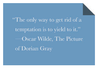
非正三角形
<!DOCTYPE html>
<html lang="en">
  <head>
    <meta charset="UTF-8" />
    <meta http-equiv="X-UA-Compatible" content="IE=edge" />
    <meta name="viewport" content="width=device-width, initial-scale=1.0" />
    <title>Document</title>
    <style>
      .box {
        position: relative;
        width: 100px;
        height: 100px;
        background: linear-gradient(-150deg, transparent 1.5em, #58a 0);
      }
      .box::before {
        content: "";
        position: absolute;
        top: 0;
        right: 0;
        background: linear-gradient(
            to left bottom,
            transparent 50%,
            rgba(0, 0, 0, 0.4) 0
          )
          no-repeat 100% 0;
        width: 1.73em;
        height: 3em;
        transform: translateY(-1.3em) rotate(-30deg);
        transform-origin: bottom right;
      }
    </style>
  </head>
  <body>
    <div class="box"></div>
  </body>
</html>
旋转角度和移动距离解析:
文本斑马线效果
<!DOCTYPE html>
<html lang="en">
<head>
<meta charset="UTF-8">
<title>Lightly-HTML-Project</title>
<link type="text/css" rel="stylesheet" href="css/style.css"/>
<script type="text/javascript" src="js/script.js"></script>
<style>
div{
width: 200px;
height: 200px;
padding: .5em;
line-height: 1.5;
overflow: hidden;
background: beige;
background-image: linear-gradient(rgba(0,0,0,.2) 50%, transparent 0);
/* 背景高度取line-hegiht的2倍,通过线性渐变实现斑马线效果 */
background-size: auto 3em;
/* 渐变效果从内容box开始 */
background-origin: content-box;
}
</style>
</head>
<body>
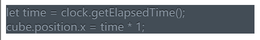
<div>
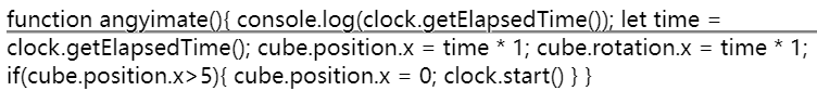
function animate(){
// cube.position.x += 0.01;
// cube.rotation.x += 0.01;
// if(cube.position.x>5){
// cube.position.x = 0;
// }
console.log(clock.getElapsedTime());
let time = clock.getElapsedTime();
cube.position.x = time * 1;
cube.rotation.x = time * 1;
if(cube.position.x>5){
cube.position.x = 0;
clock.start()
}
// 通过渲染器渲染场景和相机
render.render(scene,camera);
controls.update()
requestAnimationFrame(animate)
}
</div>
</body>
</html>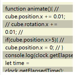
下划线效果
实线
div{
  background: linear-gradient(gray, gray) no-repeat;
  /* background: linear-gradient(to right,#ff0000,66%,transparent 0)  repeat-x; */
  background-size: 100% 2px;
  background-position: 0 1.2em;
  /* 长字母的截断效果 */
  text-shadow: .05em 0 white, -.05em 0 white;
}
虚线
div{
  /* background: linear-gradient(gray, gray) no-repeat; */
  background: linear-gradient(to right,#ff0000,66%,transparent 0)  repeat-x;
  background-size: .4em 2px;
  background-position: 0 1.3em;
  /* text-shadow: .05em 0 white, -.05em 0 white; */
}
波浪线
div{
  background: linear-gradient(-45deg, transparent 40%, red 0, red 60%, transparent 0) 0 1.2em,
    linear-gradient(45deg, transparent 40%, red 0, red 60%, transparent 0) .2em 1.2em;
  background-repeat: repeat-x;
  background-size: .4em .2em;
}
特殊字体效果
凹版印刷效果
div{
  background: hsl(210, 13%, 60%);
  color: hsl(210, 13%, 30%);
  text-shadow: 0 1px 1px hsla(0,0%,100%,.8);
}
div{
  background: hsl(210, 13%, 30%);
  color: hsl(210, 13%, 60%);
  text-shadow: 0 -1px 1px black;
}
空心字
<!DOCTYPE html>
<html lang="en">
<head>
    <meta charset="UTF-8">
    <title>Lightly-HTML-Project</title>
    <style>
        body{
            background-color: aquamarine;
        }
        h1{
            color: white;
            text-shadow: 1px 1px black,-1px -1px black , 1px -1px black , -1px 1px black;
        }
    </style>
</head>


<body>
   <h1>
      CSS
    </h1>
</body>
</html>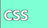
文字发光效果
<!DOCTYPE html>
<html lang="en">
<head>
    <meta charset="UTF-8">
    <title>Lightly-HTML-Project</title>
    <style>
        body{
            background-color: black;
        }
        h1{
            color: #ffc;
            transition: all .5s;
        }
        h1:hover{
            text-shadow: 0 0 .1em,0 0 .3em;
        }
    </style>
</head>


<body>
   <h1>
      CSS
    </h1>
</body>
</html>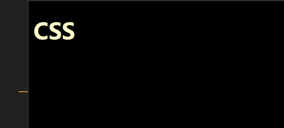
遮罩层效果
通过一个元素来实现遮罩的效果,并且对背景进行模糊处理。
<!DOCTYPE html>
<html lang="en">
<head>
    <meta charset="UTF-8">
    <title>Lightly-HTML-Project</title>
    <style>
        h1{
            color: red;
            text-shadow: 0 1px hsl(0,0%,85%),
            0 2px hsl(0,0%,80%),
            0 3px hsl(0,0%,75%),
            0 4px hsl(0,0%,70%),
            0 5px hsl(0,0%,65%),
            0 5px 10px black;
        }
        h1:hover{
            cursor: none;
        }
        main.drop{
            position: absolute;
            left: 0;
            top: 0;
            right: 0;
            bottom: 0;
            background: rgba(0,0,0,.3);
            filter: blur(3px);
        }
    </style>
</head>


<body>
   <main class="drop">
    <h1>
      CSS
    </h1>
    <p>fewa
        aa
        fewaf
        fewa
    </p>
    <input type="radio">
   </main>
</body>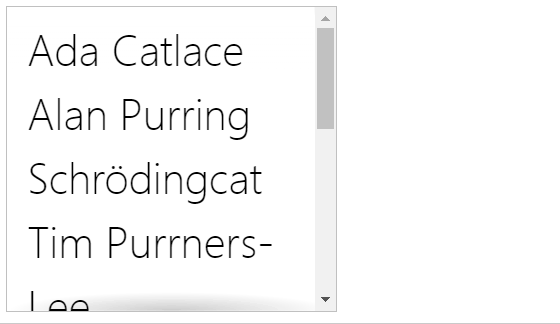
</html>滚动阴影
通过在顶部和底部添加线性渐变来达到效果。
background-attachment CSS属性决定背景图像的位置是在视口内固定,或者随着包含它的区块滚动.
- local:此关键属性值表示背景相对于元素的内容固定。如果一个元素拥有滚动机制,背景将会随着元素的内容滚动,并且背景的绘制区域和定位区域是相对于可滚动的区域而不是包含他们的边框。
- scroll:此关键属性值表示背景相对于元素本身固定,而不是随着它的内容滚动(对元素边框是有效的)。
ul {
  display: inline-block;
  overflow: auto;
  width: 7.2em;
  height: 7em;
  border: 1px solid silver;
  padding: .3em .5em;
  list-style: none;
  margin-top: 2em;
  font: 100 200%/1.6 'Frutiger LT Std', sans-serif;
  background: linear-gradient(white 15px, hsla(0,0%,100%,0)) 0 0 / 100% 50px,
    radial-gradient(at top, rgba(0,0,0,.2), transparent 70%) 0 0 / 100% 15px,
    linear-gradient(to top, white 15px, hsla(0,0%,100%,0)) bottom / 100% 50px,
    radial-gradient(at bottom, rgba(0,0,0,.2), transparent 70%) bottom / 100% 15px;
  background-repeat: no-repeat;
  background-attachment: local, scroll, local, scroll;
  margin-top: 30px;
}
图片对比效果
<!DOCTYPE html>
<html lang="en">
<head>
    <meta charset="UTF-8">
    <title>Lightly-HTML-Project</title>
    <style>
       .image-slider {
            position:relative;
            width: 300px;
            height: 300px;
            display: inline-block;
            overflow: hidden;
        }


        .image-slider > div {
            position: absolute;
            top: 0; bottom: 0; left: 0;
            width: 50%;
            max-width: 100%;
            overflow: hidden;
            /* 可以拉动图片的属性 */
            resize: horizontal;
        }
        /* 自定义右下角的拖动标识 */
        .image-slider > div:before {
            content: '';
            position: absolute;
            right: 0; bottom: 0;
            width: 12px; height: 12px;
            padding: 5px;
            background: linear-gradient(-45deg, white 50%, transparent 0);
            background-clip: content-box;
            cursor: ew-resize;
            -webkit-filter: drop-shadow(0 0 2px black);
            filter: drop-shadow(0 0 2px black);
        }


        .image-slider img {
            height: 100%;
            display: block;
            user-select: none;
        }
    </style>
</head>


<body>
   <div class="image-slider">
        <div>
        <img src="https://t7.baidu.com/it/u=2604797219,1573897854&fm=193&f=GIF" alt="Before" />
        </div>
        <img src="https://t7.baidu.com/it/u=2942499027,2479446682&fm=193&f=GIF" alt="After" />
    </div>
</body>
</html>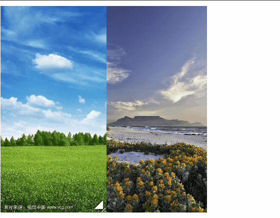
<!DOCTYPE html>
<html lang="en">
<head>
    <meta charset="UTF-8">
    <title>Lightly-HTML-Project</title>
    <style>
       .image-slider {
            position:relative;
            width: 300px;
            height: 300px;
            display: inline-block;
            overflow: hidden;
        }


        .image-slider > div {
            position: absolute;
            top: 0; bottom: 0; left: 0;
            width: 50%;
            max-width: 100%;
            overflow: hidden;
        }


        .image-slider img {
            height: 100%;
            display: block;
            user-select: none;
        }
        .image-slider input {
            position: absolute;
            left: 0;
            bottom: 5px;
            z-index: 3;
            margin: 0;
            /* 降低对比度,则会呈现出更多的灰色 */
            filter: contrast(.5);
						/*     使用混合模式         */
            mix-blend-mode: luminosity;
            /*        放大操作条,提高用户体验      */
            width: 66.7%;
            transform: scale(1.5);
            transform-origin: left bottom;
        }
    </style>
</head>


<body>
   <div class="image-slider">
        <img src="https://t7.baidu.com/it/u=2604797219,1573897854&fm=193&f=GIF" alt="Before" />
        <img src="https://t7.baidu.com/it/u=2942499027,2479446682&fm=193&f=GIF" alt="After" />
    </div>


    <script>
        let slider = document.querySelector('.image-slider');
        // 创建附加的div元素,并用它包住第一个图片元素
        var div = document.createElement('div');
        var img = slider.querySelector('img');
        slider.replaceChild(div,img)
        div.appendChild(img);
        // 创建滑块
        var range = document.createElement('input');
        range.type = 'range';
        range.addEventListener('input',function() {
            div.style.width = this.value + '%';
        })
        slider.appendChild(range);
    </script>
</body>
</html>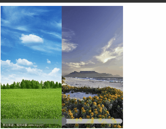
布局
:only-child
:only-child伪类表示在只有一个元素是设置的样式。
根据兄弟元素数量确定样式
固定数量
小知识:
:first-child表示第一个元素
:nth-last-child(n)表示倒数第几个元素
<style>
		/*  li有四个时,设置红色背景样式
        既满足是第一个,并且是倒数第四个元素,那么可以说明一共有四个元素,
        然后通过 (~)选中所有的兄弟元素
  	*/
    li:first-child:nth-last-child(4), li:first-child:nth-last-child(4) ~ li{
      background: red;
    }
</style>
</head>
<body>


  <ul>
    <li>1</li>
    <li>3</li>
    <li>4</li>
    <li>5</li>
</ul>封装scss的mixin
/* 定义mixin */
@mixin n-items($n) {
  &:first-child:nth-last-child(#{$n}),
  &:first-child:nth-last-child(#{$n}) ~ & {
    @content;
  }
}
/* 调用时是这样的: */
li {
  @include n-items(4) {
    /* 属性与值写在这里 */
  }
}数量范围
<style>
	/*  n+4  当数量大于等于4时设置的样式  */
  li:first-child:nth-last-child(n+4), li:first-child:nth-last-child(n+4) ~ li{
    background: red;
  }
</style><style>
.box{
width: max-content;
margin: auto;
border: 1px solid #000;
}
/* -n+4 当数量小于等于4时设置的样式 */
li:first-child:nth-last-child(-n+4), li:first-child:nth-last-child(-n+4) ~ li{
background: red;
}
</style>满幅的背景,定宽的内容
通过padding和calc()函数,让内容的宽度固定,省去了内层嵌套一个大盒子。
<!DOCTYPE html>
<html lang="en">
<head>
    <meta charset="UTF-8">
    <title>Lightly-HTML-Project</title>
    <style>
      .box{
          padding: 1em calc(50% - 300px);
          background-color: #aaa;
      }
    </style>
</head>


<body>
    <div class="box">
        <p>Consectetur et t-bone pork loin. Tri-tip cupim in, spare ribs velit exercitation in. Tempor cillum fugiat, nisi leberkas reprehenderit anim laboris proident cow. Eu fatback kevin sint, ad shoulder in venison picanha. Sausage drumstick capicola, culpa boudin pork belly minim aute ipsum biltong picanha venison nulla adipisicing.</p>
    </div>
</body>
</html>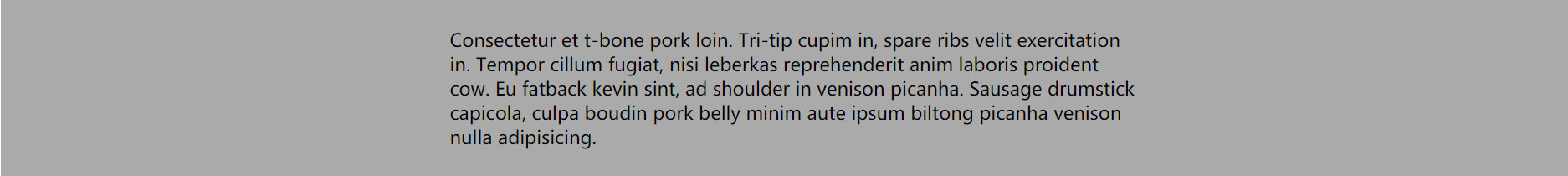
垂直居中解决方案
一、基于绝对定位
<!DOCTYPE html>
<html lang="en">
<head>
    <meta charset="UTF-8">
    <title>Lightly-HTML-Project</title>
    <link type="text/css" rel="stylesheet" href="css/style.css"/>
    <script type="text/javascript" src="js/script.js"></script>
    <style>
      .outer{
        position: relative;
        width: 300px;
        height: 200px;
        background-color: aquamarine;
        overflow: hidden;
      }
      .inner{
        position: absolute;
        width: 100px;
        height: 100px;
        background-color: aqua;
        top: 50%;
        left: 50%;
        transform: translate(-50%,-50%);
      }
    </style>
</head>
<body>
  <div class="outer">
    <div class="inner"></div>
  </div>
</div>
</body>
</html>二、flex布局
<!DOCTYPE html>
<html lang="en">
<head>
    <meta charset="UTF-8">
    <title>Lightly-HTML-Project</title>
    <link type="text/css" rel="stylesheet" href="css/style.css"/>
    <script type="text/javascript" src="js/script.js"></script>
    <style>
      .outer{
        display: flex;
        justify-content: center;
        align-items: center;
        width: 300px;
        height: 200px;
        background-color: aquamarine;
        overflow: hidden;
      }
      .inner{
        width: 100px;
        height: 100px;
        background-color: aqua;
      }
    </style>
</head>
<body>
  <div class="outer">
    <div class="inner"></div>
  </div>
</div>
</body>
</html>margin的百分比单位
margin的百分比单位,margin-left,margin-top,margin-right,margin-bottom都是相对父元素的宽度来计算的。
例:
<!DOCTYPE html>
<html lang="en">
<head>
    <meta charset="UTF-8">
    <title>Lightly-HTML-Project</title>
    <link type="text/css" rel="stylesheet" href="css/style.css"/>
    <script type="text/javascript" src="js/script.js"></script>
    <style>
      .outer{
        width: 300px;
        height: 200px;
        background-color: aquamarine;
        overflow: hidden;
      }
      .inner{
        width: 100px;
        height: 100px;
        background-color: aqua;
        margin: 50%;
        transform: translate(-50%,-50%);
      }
    </style>
</head>
<body>
  <div class="outer">
    <div class="inner"></div>
  </div>
</div>
</body>
</html>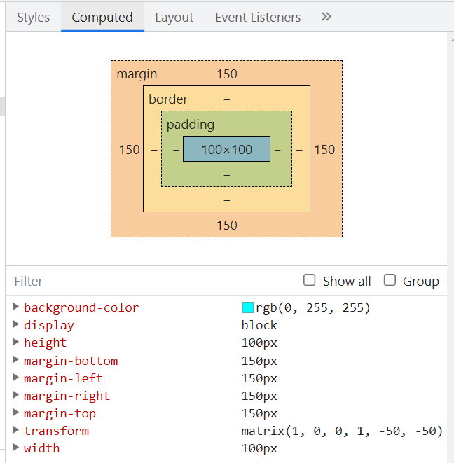
动画
弹性过渡
<!DOCTYPE html>
<html lang="en">
<head>
<meta charset="UTF-8">
<title>Lightly-HTML-Project</title>
<style>
input:not(:focus) + .callout {
transform: scale(0);
/* 缩放是重置过度效果,直接缩放即可,不需要缓冲的效果 */
transition: .25s;
}
input{
display: block;
}
.callout {
position: absolute;
max-width: 14em;
padding: .6em .8em;
border-radius: .3em;
margin: .3em 0 0 -.2em;
background: #fed;
border: 1px solid rgba(0,0,0,.3);
box-shadow: .05em .2em .6em rgba(0,0,0,.2);
font-size: 75%;
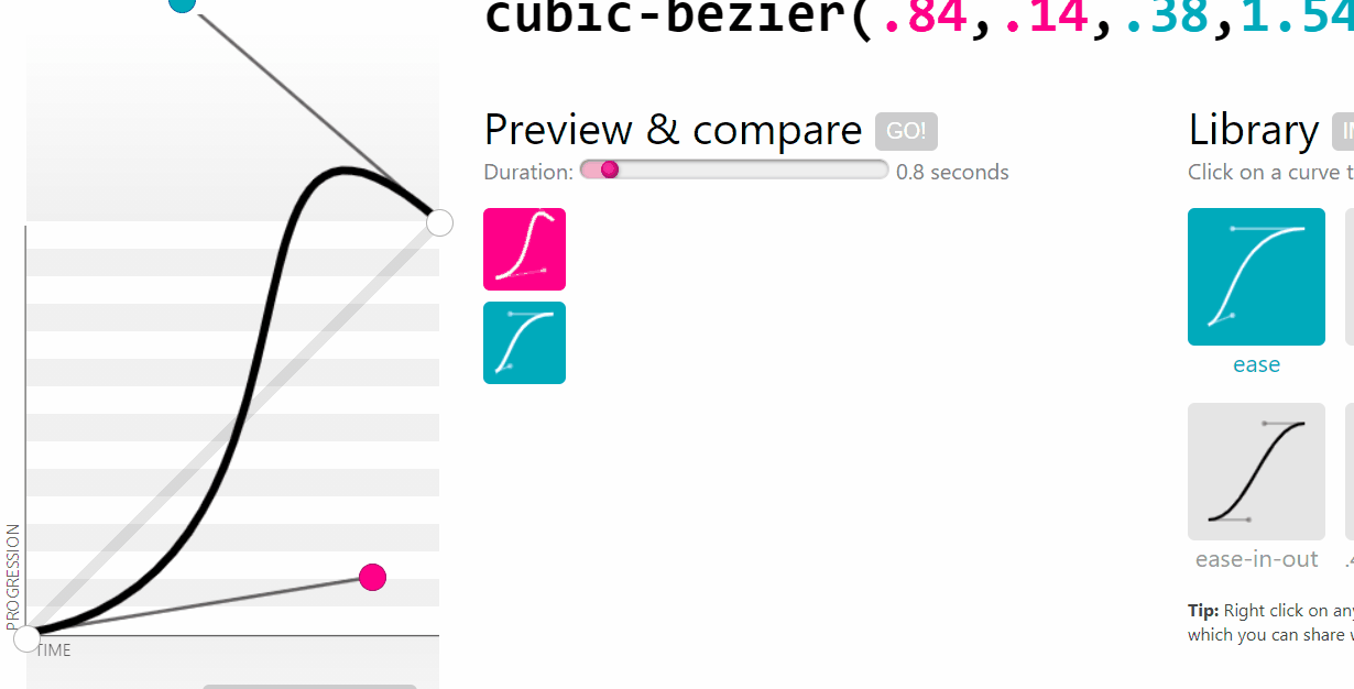
/* 通过 cubic-bezier(.25,.1,.3,1.5) 在运动过程中,超出最终状态,达到比最终状态大,又回来的效果 */
transition: .5s cubic-bezier(.25,.1,.3,1.5) transform;
transform-origin: 1.4em -.4em;
}
.callout:before {
content: "";
position: absolute;
top: -.4em;
left: 1em;
padding: .35em;
background: inherit;
border: inherit;
border-right: 0;
border-bottom: 0;
transform: rotate(45deg);
}
</style>
</head>
<body>
<label>
Your username:
<input id="username" />
<span class="callout">Only letters, numbers,
underscores (_) and hyphens (-) allowed!</span>
</label>
</body>
</html>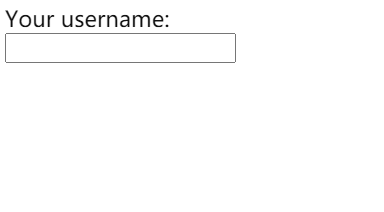
cubic-bezier()函数测试案例:当曲线顶部大于1时,就会出现超出终点,又回来的效果
打字效果
单位ch:

<!DOCTYPE html>
<html lang="en">
<head>
    <meta charset="UTF-8">
    <title>Lightly-HTML-Project</title>
    <style>
        @keyframes typing {
            from { width: 0 }
        }
        @keyframes caret {
            50% { border-color: transparent; }
        }
        /* 等宽字体中,英文和数字与 0 的宽度相同
            中文是 0 的宽度两倍
         */
        .text{
            font-family: monospace;
            /* ch 单位表示 字符 0 的宽度 */
            overflow: hidden;
            white-space: nowrap;
            border-right: .05em solid;
            /* 中文steps设置为width的一半,让每一步增加2ch的宽度
                英文steps与width保持一致
             */
            animation: typing 3s,
            caret 1s steps(1) infinite;
        }
    </style>
</head>


<body>
    <div class="text">你好呀,哈喽呀</div>
    <script>
      // 自动获取字符长度,设置steps和width
       function setSteps(el,lang){
            let text = document.querySelector(el);
            let len = text.textContent.length, s = text.style;
            console.log(len,text);
            s.width = lang === 'zh' ? len * 2 + 'ch' : len + 'ch';
            s.animationTimingFunction = `steps(${len}),steps(1)`;
       }
       setSteps('.text','zh')
    </script>
</body>
</html>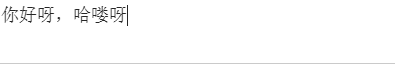
状态平滑的动画
补充说明:
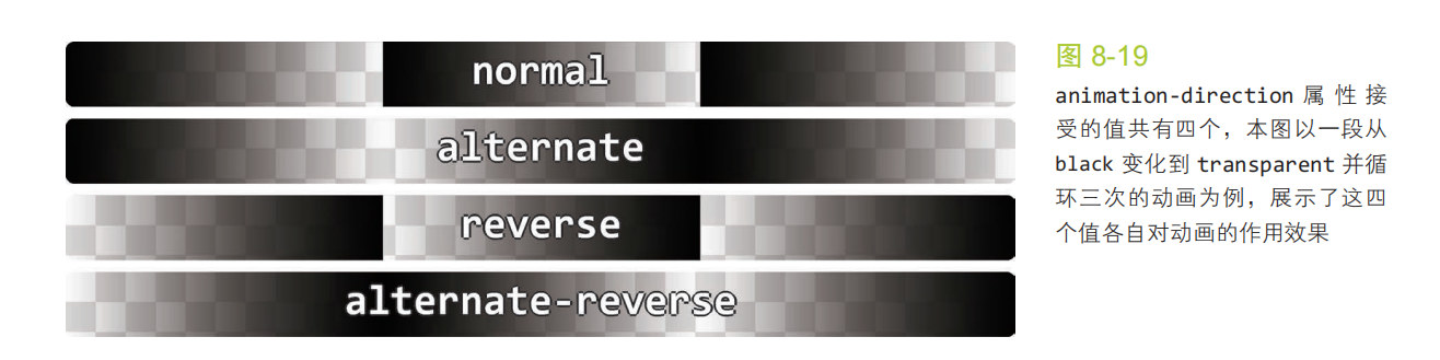
CSS 属性指示动画是否反向播放
下图示例是 黑色变为透明
css 属性定义一个动画是否运行或者暂停。
- running 当前动画正在运行。
- paused 当前动画已被停止。
<!DOCTYPE html>
<html lang="en">
<head>
    <meta charset="UTF-8">
    <title>Lightly-HTML-Project</title>
    <style>
        @keyframes panoramic {
            to { background-position: 100% 0; }
        }

        .panoramic {
            width: 150px; height: 150px;
            background: url('http://c3.staticflickr.com/3/2671/3904743709_74bc76d5ac_b.jpg');
            background-size: auto 100%;
            animation: panoramic 5s linear infinite alternate;
            animation-play-state: paused;
        }


        .panoramic:hover, .panoramic:focus {
            animation-play-state: running;
        }
    </style>
</head>


<body>
    <div class="panoramic"></div>
</body>
</html>